
I now have some census data for the Ontario census divisions and I’d like to visualize it on a map of Ontario. First I need a GIS file of the census divisions which I can get from the stats Canada website. I’ll read in the Ontario census division data and the shape file data
library(rgeos)
library(maptools)
library(ggmap)
ontario.data = read.csv("Total population by immigrant status and place of birth.csv", header=T)
sp.Canada <- readShapeSpatial('ShapeOrganizing/Boundary Files//gcd_000a07a_e.shp',
                       proj4string = CRS("+proj=longlat +datum=WGS84") )
sp.Canada is a shape file which is an S4 object in R. This means that it has different ‘slots’ which contain different attributes of the object.
slotNames(sp.Canada)## [1] "data" "polygons" "plotOrder" "bbox" "proj4string"I only care about the data slot which I can access using the ‘@’ symbol. This is a data frame which contains the identifying information of the census divisions.
library(knitr)
names(sp.Canada@data)
## [1] "CDUID" "CDNAME" "CDTYPE" "PRUID" "PRNAME"kable(head(sp.Canada@data, 5))| CDUID | CDNAME | CDTYPE | PRUID | PRNAME | |
|---|---|---|---|---|---|
| 0 | 1001 | Division No. 1 | CDR | 10 | Newfoundland and Labrador / Terre-Neuve-et-Labrador |
| 1 | 1002 | Division No. 2 | CDR | 10 | Newfoundland and Labrador / Terre-Neuve-et-Labrador |
| 2 | 1003 | Division No. 3 | CDR | 10 | Newfoundland and Labrador / Terre-Neuve-et-Labrador |
| 3 | 1004 | Division No. 4 | CDR | 10 | Newfoundland and Labrador / Terre-Neuve-et-Labrador |
| 4 | 1005 | Division No. 5 | CDR | 10 | Newfoundland and Labrador / Terre-Neuve-et-Labrador |
We first select out only the Ontario shape file.
sp.Ontario = sp.Canada[sp.Canada@data$PRNAME == "Ontario",]There is a slight issue in that some of the census division names are different in the shape file than in the data frame that I have made. I have to fix this but I’ll leave out the code.
I used the fortify function to turn the shape file into a data frame so that ggplot can map it.Now I can plot a density map of whichever of the following immigrant statistics I would like.
##  [1] "Total population by immigrant status and place of birth"
##  [2] "Non-immigrants"
##  [3] "Born in province of residence"
##  [4] "Born outside province of residence"
##  [5] "Immigrants"
##  [6] "United States of America"
##  [7] "Central America"
##  [8] "Caribbean and Bermuda"
##  [9] "South America"
## [10] "Europe"
## [11] "Africa"
## [12] "Asia and the Middle East"
## [13] "Oceania and other"
## [14] "Non-permanent residents"
I want to know what the distribution of non-immigrants looks like. First I find the proportion of non-immigrants in each census division. Then merge it with the ontario census map according to the division name. The ordering of the points in the map get mixed up when I do this so I have to reorder them.
totals = ontario.data[ontario.data$Characteristics ==
                      "Total population by immigrant status and place of birth",]
non.immigrants = ontario.data[ontario.data$Characteristics ==
                      "Non-immigrants",]
non.immigrants[["proportion"]] = non.immigrants$Total/totals$Total

#merge the data with the ontario map data frame
non.immigrants.map = merge(sp.ontario.df,
                non.immigrants,
                by.x = "id", by.y = "Division")
non.immigrants.map = non.immigrants.map[order(non.immigrants.map$order),]
Now I just use ggplot to map the data.
p = ggplot(data = non.immigrants.map, aes(x=long, y=lat, group = group)) +
  geom_polygon(aes(fill=proportion), color = 'black') +
  scale_fill_gradient(name = 'Proportion of\nnon-immigrants',
                      low = "gold2", high = "firebrick2")
p + theme + labs(title = "Proportion of Non-immigrants in Ontario")
So most of the areas outside of Toronto have significantly less immigrants proportionally. We can see the flip side of this if we plot the proportion of immigrants in Ontario.
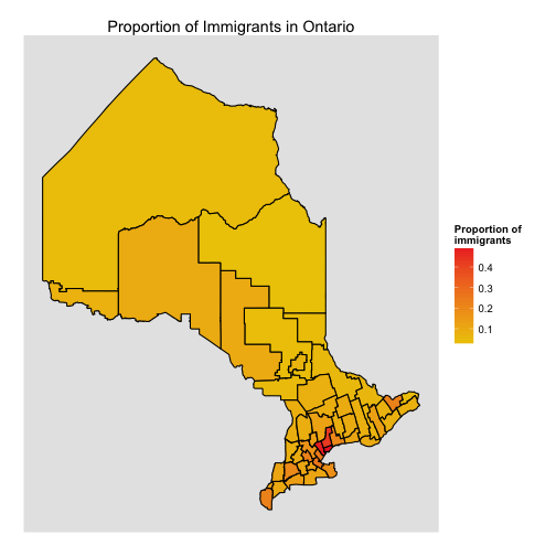
Of course this map is just the counterpart to the previous map.