
This is just a quick writeup on how to use GIS files to visualize some data from Open Data. The idea was to visualize the water consumption of the different wards of Toronto. I have a bit of an easy point to make. My guess is that that the richer you are the more water you consume. The water consumption of each ward is available here. The data is water consumption for each ward from 2000 to 2013.
First I read in the data for 2000 and 2013.
water.2000 = read.csv('CoT_Water_Consumption/Water_Consumption_2000.csv', header = T)
water.2013 = read.csv('CoT_Water_Consumption/Water_Consumption_2013.csv', header = T)
There is data for commercial accounts and residential accounts. The ammounts are all in metres cubed. Here’s a quick look at the data for the first 3 wards.
| city.ward | year | residential.accounts | annual.residential.usage | average.residential.usage |
|---|---|---|---|---|
| 1 | 2000 | 8001 | 3205060 | 400.58 |
| 2 | 2000 | 9909 | 3567371 | 360.01 |
| 3 | 2000 | 10389 | 2821739 | 271.61 |
| city.ward | year | commercial.accounts | annual.commercial.usage | average.commercial.usage |
|---|---|---|---|---|
| 1 | 2000 | 148 | 4730288 | 31961.41 |
| 2 | 2000 | 245 | 12607962 | 51461.07 |
| 3 | 2000 | 97 | 3094197 | 31898.94 |
Here is a quick plot of average water consumption over the years. I faceted the data according to whether it was residential or commercial use.
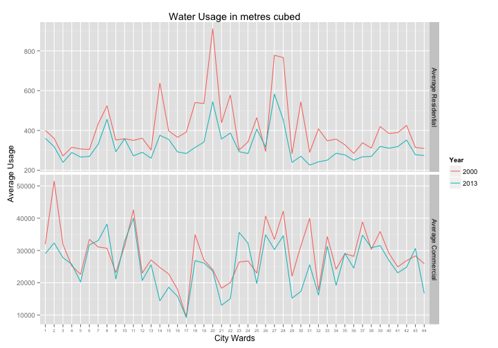
So the ammount of average water consumption looks like it has been going down over the years. This is a little unexpected and heartening for me. I was also interested in seeing how the water consumption varies throughout the different wards of Toronto. Who is using the most water? I thought a good visualization of this would be to construct a heat map of the water consumption. To do this I used the GIS information for ward boundaries available at open data Toronto.
First read in the shape file and rotate it so that the topmost boundary is more or less flat.
library(maptools)
ward.map = readShapeSpatial('gcc/icitw_wgs84.shp',
                               proj4string = CRS("+proj=longlat +datum=WGS84") )
ward.map = elide(ward.map, rotate=13)
Next I use fortify to turn the spatial object into a data frame. Then I use ggplot to map it and the polygons that are the ward boundaries.
library(rgeos)
ward.map.df = fortify(ward.map, region = "SCODE_NAME")
ward.map.df$id = as.integer(ward.map.df$id) #fixes ward labels
ggplot(data=ward.map.df, aes(x=long, y=lat, group=group)) +
  geom_polygon(fill = NA, colour = 'black') +
  map.theme #theme for map plots not defined here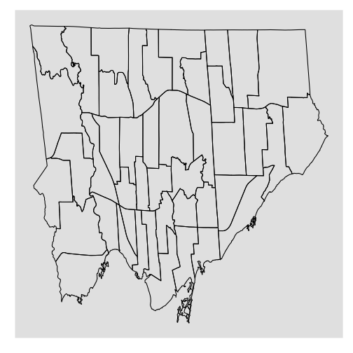
This looks very basic. I’ll add the ward numbers to each ward and make that heat map. The first step is to merge the water data and map data together. I also find the centroids of each polygon and label them according to the ward. I will use this labeling to identify the wards in the final plot.
# merge the water data and map data together
total.df = merge(ward.map.df, water, by.x = 'id', by.y = 'city.ward')
total.df = total.df[order(total.df$order), ]

#find centroids of polygons for ward labelling
centroids  = as.data.frame(gCentroid(ward.map, byid = T))
# keep track of which polygon the centroid is in
centroids[['id']] = ward.map@data$SCODE_NAME
Now I can make that heat map. Here are the residential maps. (I didn’t include the code for the 2013 map since it would be redundant.)
total.df.2000 = total.df[total.df$year==2000,]
pAverageResidential <- ggplot(data = total.df.2000, aes(x = long, y = lat, group = group)) +
  geom_polygon(aes(fill = average.residential.usage), color = 'red', alpha = 0.6) +
  scale_fill_gradient(name = 'Average residential\nusage in metres cubed',
                      low = "cyan3", high = "blue3") +
  labs(title = "Average Toronto Residential Water Usage in 2000")

pAverageResidential +
  map.theme + #theme for a map plot I defined earlier
  geom_text(aes(x=x,y=y, group=NULL, label=id), data = centroids, size=2) #ward labels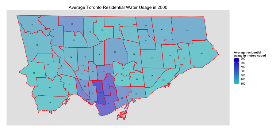

So water consumption throughout Toronto has gone down but still the downtown core definitely seems to be using the most water. And in particular, ward 20, the Trinity-Spadina area of Toronto is using quite a bit more water per person than the rest of Toronto. I really don’t have any good idea why this might be. I initially thought the wealthier areas of Toronto would consume more water. The simplest factor I had in mind was swimming pools. But it looks like this does not matter so much.
Here are the maps for commercial water consumption.
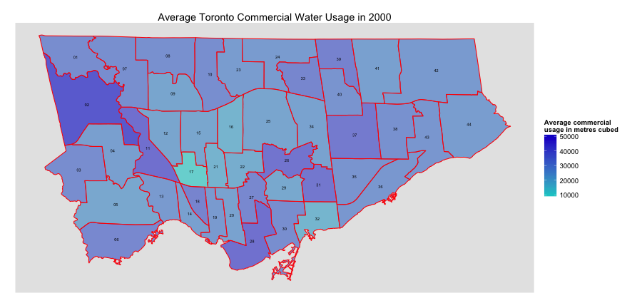
 It looks like ward 2, Etobicoke, is the heavy user of water commercially. Any ideas why this would be the case?